
As a product designer, I love to create things that combine different media and transcend the traditional boundaries of technology domains. If the project would benefit from it, I love to go that direction. I’m also very interested in hardware connected software. Owning that whole stack top to bottom results in a controlled and elegant user experience.
I’m especially attuned to accessibility needs, because I have people in my family that have special needs and that affects how they use technology. Actually, they rely on their devices to help them complete everyday tasks that people often take for granted. So if an elegant product can help an experience become more accessible, I’m all for it. In fact, I always bake accessibility into all my designs with these considerations at the forefront of my process. It’s really inherently a part of what I do. Every product I design I want to be a powerful experience that anyone – whether non-tech-savvy or disabled can use easily to accomplish their goals and ultimately, in some way improve their life.
I. The Design Problem
I was approached by a client about creating a unique captioning system for his venue.
The client conceived the idea after experiencing a captioning system at the Metropolitan Opera house in New York City. He wanted to have in-seat monitors that would display live captions of what the speaker was saying on stage in his venue. This functionality is much more complex than what the Met Titles system offers.
Through research, I discovered that Met Titles system was installed with a 14 million dollar budget. We were working with a little bit less resources… a lot less actually, but I’m great at creating amazing experiences, even on a budget.
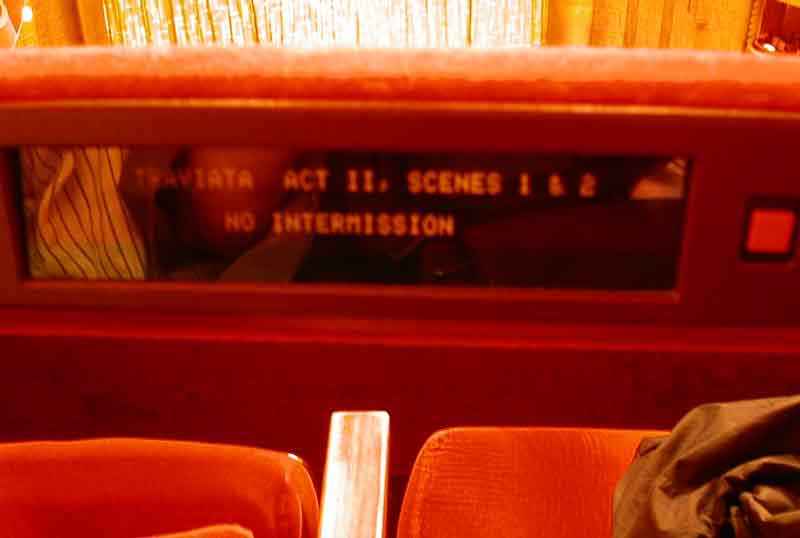
a $14 Million custom installation in the 1990’s
The system in the Met works great because the performance is scripted beforehand and the operators know what the titles are going to say. The operators just need to keep the captions in sync with the performance. What about when a performer isn’t following a script?
The client’s venue hosted speakers that often did not use a script, or in most cases had mixed scripted and unscripted oration.
My job was to design a system for the venue with a complete custom software and hardware integration that would provide real time automatic captioning to multiple patrons without the need for a skilled transcriptionist. In other words, multiple displays needed to be set up to show subtitles or captions of spoken word, all in sync and without a trained specialist operating the system and, in many cases, without prior knowledge of what exactly would be said.
II. The Process
I tapped into every one of my skill sets to develop LiveTitles. Many design decisions depended on problem solving in different areas among vastly different domains, so it was quite a challenge juggling the entire creative process. It was so complex, I won’t be able to delve into every detail in one article, but here’s a bit more about how I did it:
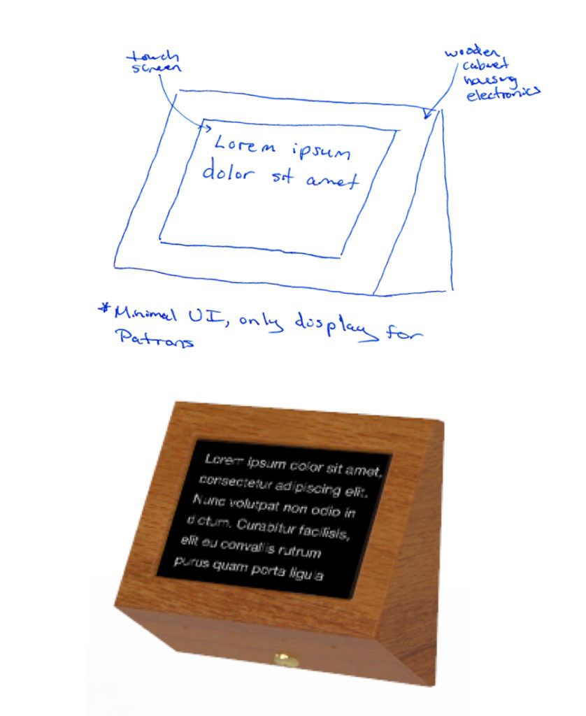
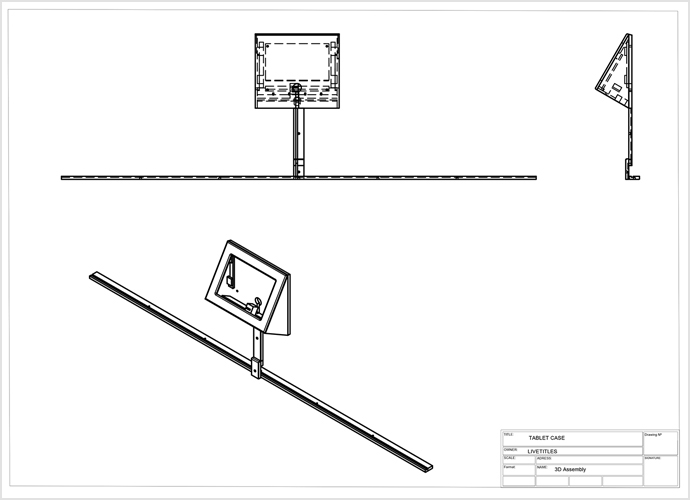
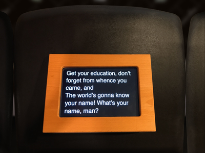
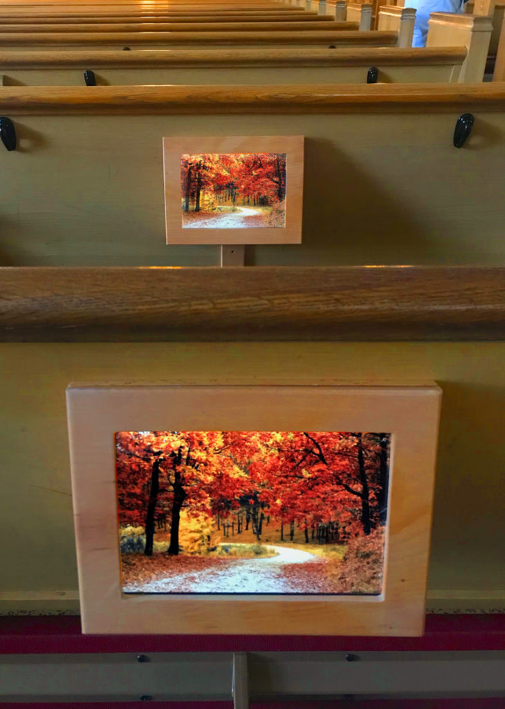
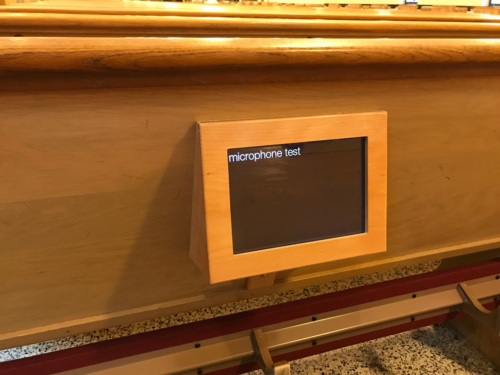
Early on I ruled out tiny displays. MetTitles were just too small for our use case. Many patrons of the venue are elderly and wouldn’t benefit from something that was too small to read. I also wanted full color to be an option in case we ever wanted to leverage the displays for different uses. We needed something larger. But I wanted to house that display inside of something that matched the venue’s existing construction.
So I drew up some concepts for special wooden cabinets to match the decor of the seats and surrounding architecture in the venue.
The seats were wooden church pews, and specifically, based on my extensive research into woodgrains, white oak. It was stained and finished with a polyurethane gloss, so it was important to me that the wood that the display housings were made out of, matched these as closely as possible. Not an easy thing to do when your origin was fabricated 70 years ago and you’re dealing with a stain that alters and augments the color of wood, not covering like a paint would. I wanted these units to look like they were always meant to be there, an extension of the existing wood benches so the woodgrain had to be present.
This was a high end job, and that needed to be reflected in its appearance to patrons. This matching was also important so as not to be a distraction. I didn’t want anything big and bulky or terribly noticeable. These displays are meant to augment the experience, not distract from it. So it was important that when they were noticed by patrons it looked like they were meant to be there and not take away from the heritage of the existing construction.
Once I settled on a concept for the displays, I needed to prove we could send audio out to a transcription service and receive back accurate text captions with extremely low latency. What’s the point of captions if they are too far behind the audio that’s being spoken? That would just create more confusion for the users we are trying to serve with this product.
I experimented with a number of transcription services but ultimately Google Cloud Speech provided the best results. Although fast and robust, there are some limitations currently including handling for some accents and dialects and blacklisting certain words (we created this functionality on a separate layer on our end.) We’re in the early stages of Audio processing by computers. Anyone using Siri knows these AI systems are not perfect, but with ideal environmental conditions, they tend to be very accurate. With Neural Networks as foundation of these systems, they are constantly learning and automatically improving from input by all users of the API.
However, we segmented this API connection out into its own component to keep things modular, so that it can be changed to a different Speech API offering easily in the future if needed in the event that a different transcription API takes the lead with better service, more options or other features that suit the needs of the product better.
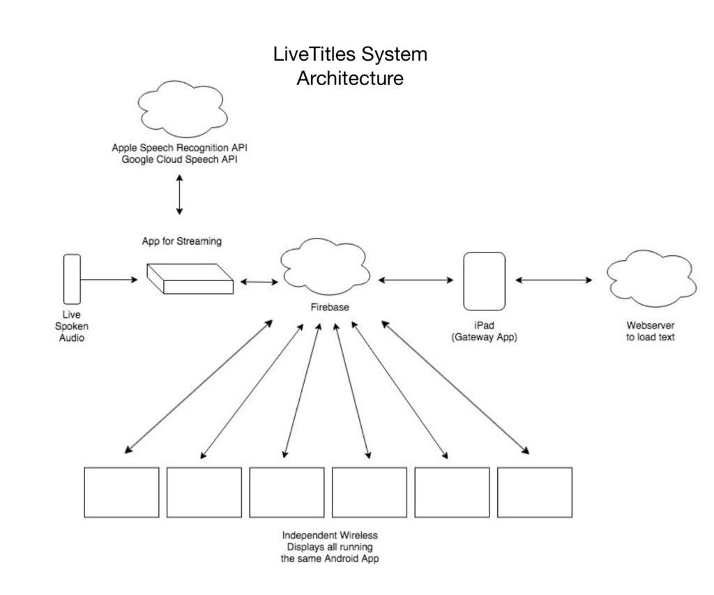
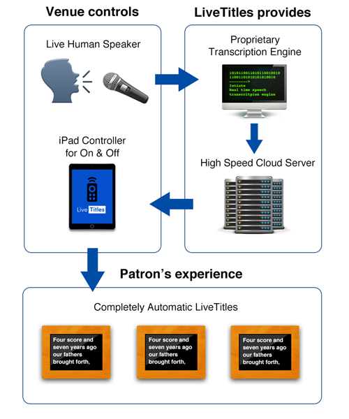
An on site server sends house audio up to the cloud for live processing, then sends the results back to the venue’s displays. The displays need to be synchronized as much as possible so every patron would have the same experience. We don’t want different text at even slightly different times for users. Every user should have, and therefore every screen should present, the same experience.
So I experimented with using a master screen that all the other screens followed, but that wasn’t an ideal design. Fortunately the data we were transmitting was small and using Google Firebase the transmission was so fast and with such minimal latency, that we were able to use simultaneous connections from each display directly to the cloud server. Each of the screens individually could pull from the server several times per second, with no synchronization problems.
For his specific use case, some parts of the presentation are spoken on the fly, off the cuff, but others parts are read from a scripted format. While the transcriptions are quite accurate, by my tests about 90% under prime conditions, I thought it would be best if the system also employed an option similar to MetTitles where known texts can be loaded in and synced up with a speaker for 100% accuracy on the words. The only variable would be timing.
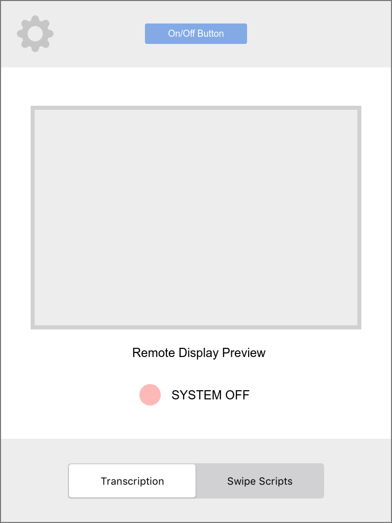
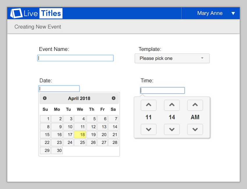
Next, I needed to design software that could control all this. I wanted to use a tablet to be the “key” to the system. Everything can be controlled from one simple iPad App.
Ultimately, I decided for parts of the performance that were already known, we would automatically load text scripts that could be loaded from a web based admin panel.
I designed an interface where a user could swipe with their finger over words on the screen. When a swipe action is performed across a word, specifically from left to right, the way words are read in English, then that word gets pushed to the remote displays instantly.
So in one mode, automatic transcription services are fast and responsive but maybe not 100% accurate, but in swipe mode, operated by a human, the text would be perfectly accurate with potential timing variables minimized the better the user is matching the speed of the speaker while swiping the words. Keeping this swipe action on time is not hard to do, even for new users.
But it was important to me that the system be able to switch between modes on the fly, without any perceptible difference to users of the system or operators besides a simple switch to control the mode setting.
Intentional UI
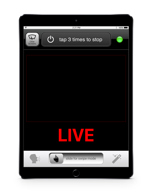
A requirement from the client was that the system be as automatic as possible. Basically, he just wanted to push one button to start the system and push one to end it. Ideally the system could start automatically at set times, but I decided that letting a computer decide when to send private audio out to the internet automatically without human interaction could open up some problems, not the least of which could be privacy issues, and potential unknown hot mic issues. Since this system could be used at varying times, it would be best to require a human to turn it on and off with minimal interactions. Therefore I opted for a manual start switch.
As a user, I hate when things go wrong with touch screens. I can name countless products that are built incorrectly with tiny actions causing terrible results. Even the latest Twitter iOS App can knock you way out of threads by misinterpreting a vertical scroll as a horizontal swipe gesture, and pushing you back a few screens. The action is so minimal, such a light touch can cause drastic problems in the experience. It’s way overboard, totally broken and I can’t believe it hasn’t been complained about or fixed yet. While anecdotal and maybe not the biggest deal in the world, these little UI bugs are present in many more products than just Twitter, and really manifest themselves as bad UX. I always go out of my way to design things that avoid these issues. Especially when the mission is critical.
For example: A simple button to turn the system on and off with one tap could be disastrous in a real world scenario. Think about it, the whole premise of this system is to augment an experience for people who can’t fully enjoy it without this service. If the service goes down, it pretty much ruins the experience for the user. So what if the iPad controller app is accidentally tapped through normal usage or just by chance? We don’t want the system turning off by accident and interrupting service. Likewise we don’t want the system on with hot mics when not intended either. So I designed this switch. Drawing from Apple’s “slide to unlock” user interface element, it’s a slider switch to start up the system. I because some other UI controls also user a slider to toggle between 2 different modes, I wanted to avoid the use of a switch to turn off the system. Having 2 sliders on screen at the same time could not only cause user confusion but further perpetuate an accidental scenario where a slider is unintentionally executed.
So my design has the slider change to a tappable button. But the button doesn’t require just one tap to turn off, it requires 3 taps, in succession with a 9 second cool down. So if a user accidentally taps it, no problem, within 9 seconds the button will return to it’s normal UI state, but 3 intentional taps back to back and the system shuts down. By having the system detect 3 deliberate taps, we eliminate the possibility for many potential issues.
and animation that I designed
In the end, the system consists of a web interface for venue admins to control events and pre-scripted captions in the form of text scripts that can be uploaded or copied and pasted, an iPad App used by a venue operator that controls the functions of the system for On and Off and the optional swipeable pre-scripted mode, custom software for a server computer that serves audio into the cloud, a cloud server that facilitates the audio to text transcription, and a internal company admin interface to onboard additional venues.
Understanding LiveTitles in 30 Seconds – iPad Remote Controller, LiveTitles Display and Venue Audio Microphone in one shot.
These devices are all wirelessly connected via a low latency server, none of them are hardwired together or connected locally.
Further, I designed and built portable demo units and companion Apps for sales people to give live, in-person demos of exactly what the product would look like.
Branding Elements
I also designed the logo, branding and marketing for LiveTitles.
This logo went through very few iterations before I settled on it. Mostly I experimented with the angles on the display cabinet icon to get something that felt right but I knew I wanted a 2 color logo with positive and negative space evocative of some of the UI elements in the Apps and expressive of the simplicity the product offers. I remember settling on the font choice because of the clean lines and equidistant geometry. I tend to like “O’s” exactly circular in logos, for example. While there are no O’s in live titles Royal blue, I liked that this font – Sofia – has no serifs or terminals on letters like the lower case T Just nice round circular curves and right angles.
It looks a bit Microsoft “Windowsy” but in the sense that it’s clean and looks nice and official, I think that’s a success.
But wait, there’s more
But what if these LiveTitles are not needed by a patron in the seats and they find them distracting rather than helpful?
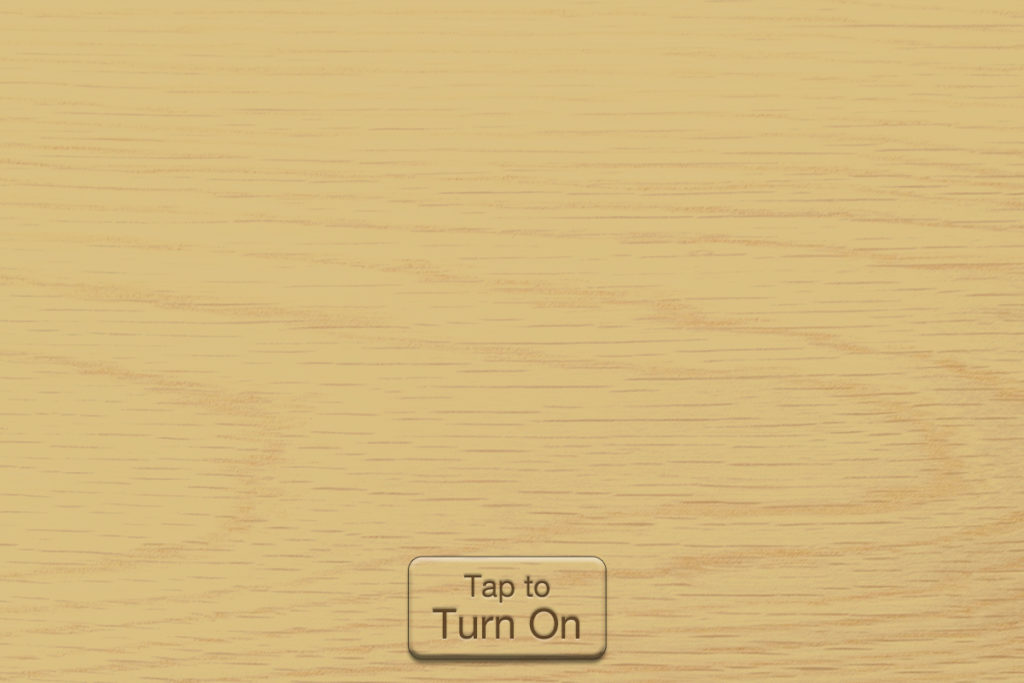
I designed this screen that pops up with 2 taps on the display that will hide the screen functionality with a wood style overlay that matches the wooden box, blending seamlessly with the surrounding texture.
The wood overlay image is calibrated to match the wooden display cabinet perfectly on a per venue basis. No matter the color of the display housing, this interface is designed to match perfectly.
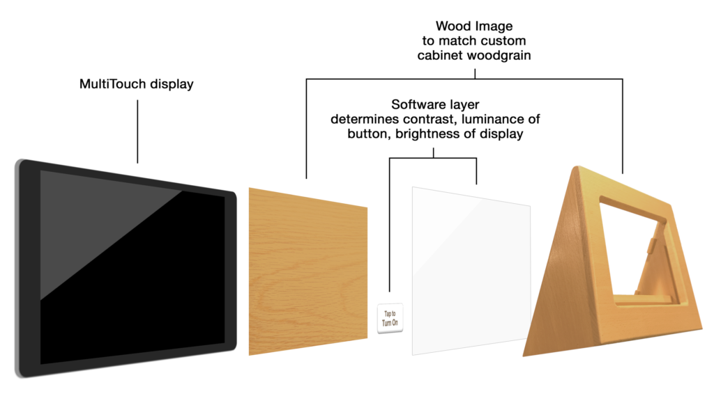
There’s been a lot of push back on skeuomorphism since Apple unveiled the flat iOS 7 way back in 2012. But honestly, I think it has swung too far in the other direction. Skeuomorphic elements done with intent and in good taste still add to design. And in this case, serves to blend the UI right in with the custom manufactured wood display cabinets when necessary.
If you would like me to create a complex system that provides an easy experience for your users – with or without skeuomorphism – contact me!