
Morpho is a great protocol that sits on top of other protocols like Aave and Compound. It allows for better rates for lenders and borrowers by optimizing efficiency in the lending process through a peer-to-peer pool, and automatically moving assets between direct, peer-to-peer lending and the regular lending pool as needed making it in a user’s best interest to use Morpho, rather than Aave or Compound itself.
But as the team is gearing up to launch V3 of their Aave ETH Optimizer, they knew they needed some changes but weren’t sure where to turn.
So I answered the call.
Interactions with Morpho AaveV2 Optimizer were complex. Actions such as supplying liquidity or borrowing, would often span multiple tokens and multiple actions, requiring signing many transactions. While this is understandable for many people already in the relatively nascent DeFi space, Morpho wanted to make things better for the V3 launch of their flagship product: AaveV3-ETH Optimizer.
Here’s a user flow I laid out demonstrating how the bulker contract can handle consolidating many other actions.
By creating a “bulker” contract, Morpho ingeniously developed a way to bulk multiple actions into single transactions.
While the user must always explicitly sign certain actions, by signing the bulker contract, a user can grant it access to perform some actions on their behalf, consolidating the process.
While the new bulker contract was complete and functional, the challenge was to create a user facing front end that was not only representative of the Morpho brand, but also effectively communicates what is actually happening to the user without to much “noise” or visual clutter while also keeping them informed.

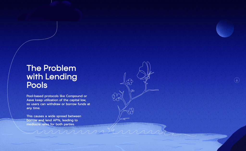
Keeping in line with the Morpho branding around line art in the form of a Continuous Line Drawing and the life cycle and natural habitat of a butterfly, I came up with the idea to name the “bulker” feature “Cocoon” as in, something wrapped up tight into a nice little package. That’s essentially how the bulker contract works, by wrapping up multiple complex transactions into a neat little package behind the scenes.

Even more important was the functionality.
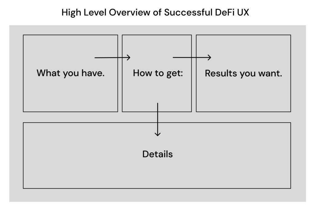
I’ve had success with a layout like this previously:
By separating current states as to:
1. a users current status
2. desired results
3. the path to achieve these desired results
4. details about that path
we can make it clear to the user how to get from where they are to where they want to go.
I started by laying out some early wireframes of what this interaction could look like.
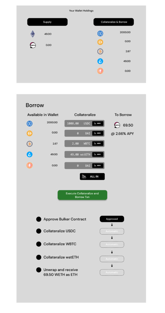
It was very important to me to weave Morpho’s unique brand through their user interface. With a heavy use of a continuous line drawing, I decided this would be a great motif to tie right into the UI. The line art moves from the users address through a panel with their current holdings down to the next steps connected to the action taking those steps will enact, and then finally to the result of completing these steps, in this case their APY and Morpho token rewards.
By using it in the background in a minimalistic way, we could make the interface clean and functional, even more understandable while simultaneously incorporating the Morpho brand.
This is something many companies overlook. A brand should be seamlessly integrated in the user experience of a product.
A final comp of a drastically improved UI that would be more informative for users, while ensuring they were gently reminded that they were interacting with the Morpho ecosystem:
