MuleChain aims to be the Uber of parcel delivery. The idea is that if you’re traveling from Singapore to London, for example, you might want to earn some extra money by hand delivering a left behind item or important physical document that someone else needs to be delivered from Singapore to London at the same time. Take it along with you, and simply get paid for the delivery. Using blockchain technology, we can have confidence in transaction, courier, and delivery.
The founder, Ralph Liu, is a talented C level executive with years of experience in international banking and high volume worldwide transactions.
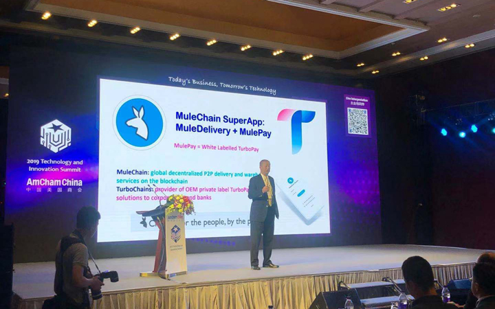
Technology and Innovation Summit in Beijing
Despite world class leadership and the timeliness of the product with the sharing economy in full swing, this is an ambitious project to say the least competing with the likes of UPS, FedEx and DHL which are logistics giants, not to mention every country’s own government delivery services.
There are serious challenges inherent to this blockchain backed parcel delivery model, not the least of which is the complexity of sourcing and relying on people who are already traveling to a particular destination in a time sensitive scenario.
Nevertheless, the team and I were confident that many of the challenges could be addressed and greatly mitigated if not completely solved by leveraging technology and great design. But, of course, that involves handling many complex tasks behind the scenes on the back end in order to make things accessible for the workforce that will make this whole system run.
What we’re facilitating is a 2 sided marketplace, with a buyer and seller. The buyer is buying parcel transport services, the seller is selling their delivery service.
The customer acquisition on “priming the pump” with these type of services is always a huge challenge. Then once it’s off the ground, you have to keep it working. Without one side the other side can’t function and your raison d’être doesn’t matter anymore.
In that sense it’s similar to Uber. But it differs in so many ways too.
Here we’re transporting physical goods. And the person sending the parcel is obfuscated by the fact a different person is transporting the parcel. If it sounds like something could be used for contraband here, you’re absolutely right. So that’s another challenge.
I believe in time technology can solve all these problems keeping a balance between privacy and also ensuring the security of the person transporting the parcel.
However, I also believe in Mr. Wonderful’s “pioneer” quote.
Many times the guy who does it first “get’s the arrow in the back.”
But the subject of this particular article is how understanding the end user relates to growth of the user base.
I was brought on board to help design user interfaces and consumer facing apps for a widespread launch after the company’s alpha testing.
Logistics are complicated. You can imagine the layers of complexity when we’re securing a high volume of time sensitive shipments to numerous ever changing hyper specific locations and thousands of touch points with blockchain technology.
Additionally, making blockchain understandable, making users aware of the value proposition of having records stored on an immutable blockchain, is also extremely challenging because in order to succeed, we need to reach beyond just cryptocurrency enthusiasts. We have to reach a greater number of mainstream users than just people who have heard of, or have an understanding of how to use crypto.
One of the major stumbling blocks to mainstream cryptocurrency adoption is ease of use. To this day, Bitcoin and other cryptocurrencies remain complicated for average users. I put together a guide on Bitcoin Basics at https://dyn.am/bitcoin if you’d like to learn more.
So there are plenty of strides to be made in the user experience of these new technologies that many users find intimidating. It’s also easy to make a costly mistake through lack of experience with cryptocurrencies. Centralized systems have solved some of these ease of access problems, but at a cost of other features. This trade off and convincing users of value in blockchain based cryptocurrency other than what they’re used to with traditional legacy transactions, is still a challenge for cryptocurrencies seeking mainstream adoption.
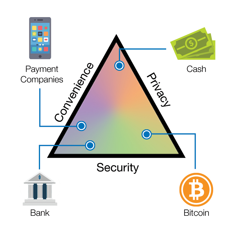
However, there is no need for user facing interactions with the foundational blockchain layer. Our users won’t need to do any complex transactions. They’ll be written to the blockchain – the private company MuleChain – but they don’t need to delve into the complex details of that transaction.
Still, in order for MuleChain to succeed, it has to have mainstream appeal and attract many users. Without the network being online and constantly running with what the company calls “Mules” (couriers) willing to participate in parcel delivery, the service will not be viable long term. If a shipper can’t get anyone to deliver a package for what they feel is a fair rate, they’re unlikely to continue using the product.
First impressions are so important for this type of product. The first experience has to be memorable in an extremely positive way and bring the user success. If not, you’re likely to lose them forever.
Why would anyone give a second chance to something that didn’t work for them when there are so many other options?
This is why great design is critical to any new product’s success.
As mentioned earlier, success involves priming the pump of self sustaining system. Think about starting Uber. Scaling an always-on worldwide delivery network up from zero to service everywhere. Daunting.
The fundamental challenge or barrier to overcome here is gaining traction with users.
Services that succeed at this can become profitable making only little money on each transaction. But the science – and art – of striking the balance between keeping service providers happy with enough steady demand, while keeping people making shipments happy enough paying the prices and using the service because of its convenience and reliability, which then perpetuates the supply, is incredibly complex and difficult.
It’s a billion dollar balancing act. Get it right, and your market cap will be in the billions. Get it wrong, and everything collapses and the business doesn’t function. Worth zero.
That’s what we’re doing here, providing a 2 sided marketplace platform to facilitate a transaction between these 2 other parties. There needs to be enough supply and demand at all times to keep the service running, and ultimately retain users.
If:
A. the value proposition is not immediately apparent to the user,
B. the interactions are too complex, and/or
C. the interactions do not perform as expected for the user when trying to accomplish their goalthen, the product is D.O.A.
– Dan Martin
And this really is a simple cost-benefit analysis that all users subconsciously conduct when using any product or service.
A great way to kill a product is to have it not working when people go to use it. Sometimes – most times – that’s your only shot, and you could lose them as a user/customer forever. Unless you’re “the only game in town,” people just go elsewhere. The digital marketplace is huge, cutthroat and filled with competition.
It’s so important to a growth strategy to have a great user experience. It gives the company the best chance for success.
It’s kind of a catch 22 in the sense that the more users you have, the better the experience will be but in order to gain more users, you have to have a great experience.
So fundamental to solving this general scaling problem is helping to scale the user base of both providers and users by increasing the chances that everyone wants to work with us through having an easy to use App experience that sets them up for success.
Again, logistics is highly complex, I can’t emphasize that enough, but simplicity for the users touch points is central to this business, even once everything is completely up and running and especially for first impressions.
Research
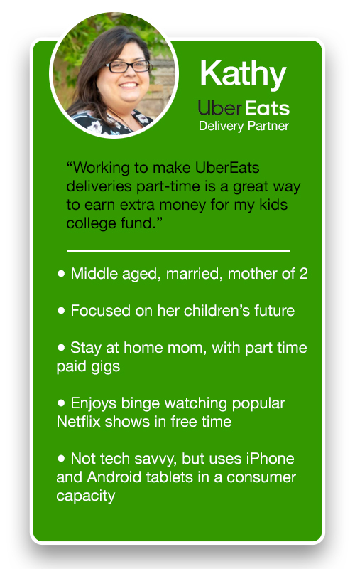
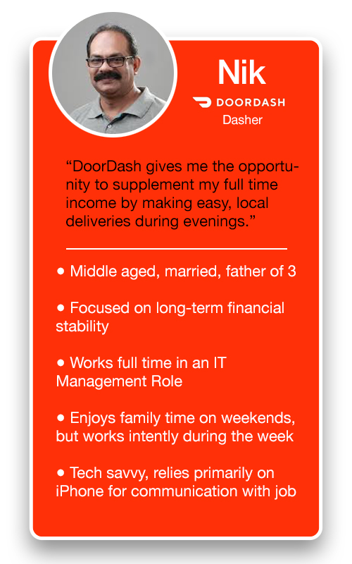
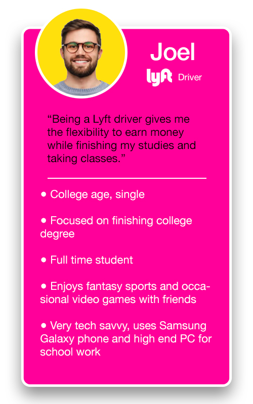
What we found in our research is that drivers and delivery partners for other providers make up a diverse group.
However, they all shared a specific commonality, they loved the opportunity to receive simple instructions received from an App right on their phone and, if followed, simply earn money.
While the sign up process was slightly complex for these other services, once approved the tasks themselves were easy.
Based on our study, the average target market for delivery partners in our use case are more similar to courier partners and drivers making money on UberEats/Uber/DoorDash/Grubhub than to average cryptocurrency users.
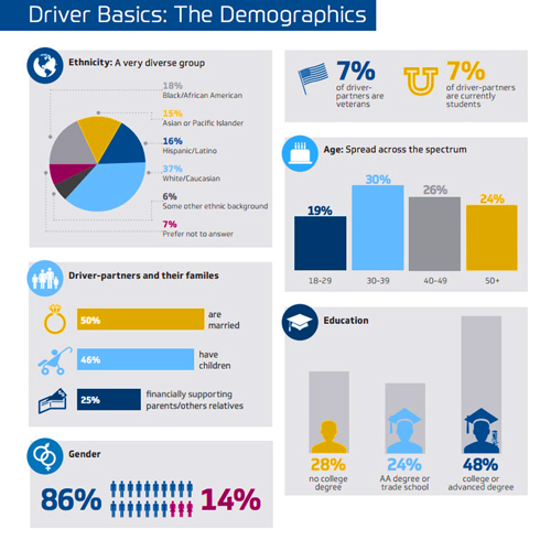
Workers in this group just want to turn on an App, receive an instruction, follow it, and make money. They don’t want complicated processes and in many cases are not tech savvy “power users” who can handle complex setups or technical hurdles. They want to hit a button in an App, receive a simple instruction, and go and start earning money. That’s how these respective services gained traction in the first place. Ease of use. Let’s face it, no one wants overcomplicated processes getting in the way of making money.
The closer our User Experience is to the UX of these other services, the wider the appeal we will have and the more users we can expect to retain. This is vital to the growth and success of the platform.
What would happen if Uber Drivers suddenly weren’t available? Yes, self driving AI cars are coming, but they’re not here yet. The service would be in tailspin.
The company has to handle all these logistics seamlessly in the background, so the users can simply open their app, and decide with ease whether to take a delivery or not.
I always learn about business operations on the ground, before making any final recommendations on directions for UI design. But there were important elements from the start, and intersection with other services like Uber, DoorDash and Postmates for example and in this particular instance, it was requested that I show the design team some early concepts of a fresh direction of where we could take the App’s visual style based on some research.
Besides my passion for cryptocurrency, I have a great admiration for services like Uber and DoorDash that automate complex tasks coalesced with actual human resources. I knew as soon as I learned about the driving force behind MuleChain that this service had striking similarities with other on-demand services.
While “Uber of x” has become almost a cliche in the tech space, MuleChain really is building the Uber of parcel delivery.
So here are a few early concepts of the initial design in the vein of Uber.
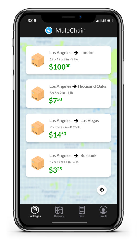
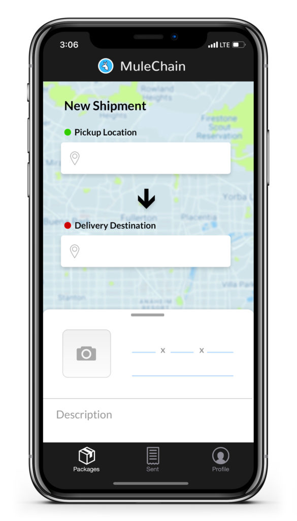
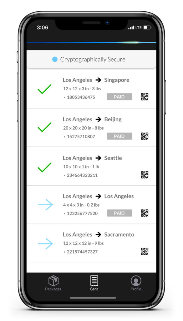
I can’t emphasize enough how early these designs are. The team simply wanted something to show developers and the entire team a concept for a potential art direction and look and feel of the UI.
There are serious issues with some of the floating navigation and small text on apps like Uber. Some of these UI elements are absolutely terrible for people with visual impairments which has a great deal of overlap for people who use these type of services especially in a mission critical way. So MuleChain designs will strive to be more user friendly and considerate of people with disabilities, but the UI needs to channel the themes of mainstream Apps that offer similar functionality. These initial concepts need some work, but are more in line with big players in the sharing economy, helping to create a familiar experience and thereby making it more likely that people in these groups would also be interested in using our App.
I never like to reinvent the wheel when there are things in the market proven to work. But innovating and iterating as to improve shortcomings of “the wheel,” is my specialty.
Branding: What Works and Doesn’t Work
There are concerns with some of the branding around this product.
In order to create great products that succeed, everyone has to be open minded and sometimes that involves having to discuss difficult topics. I am a very down to earth person, comfortable speaking about any topic and rarely – if ever – offended. I only look at things from the consumers perspective and I have a great sense of how other people perceive things.
I don’t think any new product should be associated with contraband, nevermind one with the challenge of creating a new market and garnering mainstream appeal. And MuleChain has some issues regarding this. Not only is the word “Mule” in the name, which has connotations to running illegal drugs, but the entire premise of the business model is based around having what the company calls “Mules” or “MulePals” deliver potentially anonymous packages all over the world.
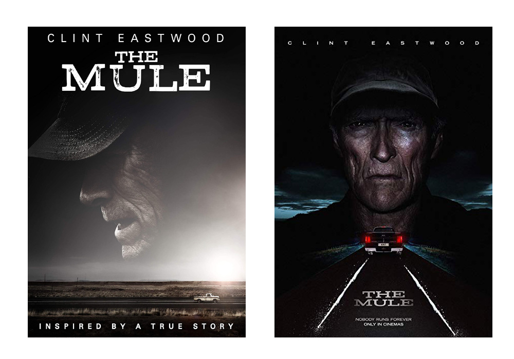
There’s even a 2018 movie named “The Mule” about a guy forced into becoming a drug runner…
The idea around MuleChain is supposed reduce reliance on legacy couriers, improve shipment speeds, availability and cost. It’s supposed to open up opportunities and build trust in a peer to peer way and using an immutable record courtesy of a custom blockchain. But I believe this is undermined by the branding. When the goal is to build up trust, any company needs to avoid connotations to drug references. There’s already a Herculean task making sure the company image is trustworthy so we can gain users. The branding was conceived innocently enough, but it’s a little too on the nose in the wrong direction.
I’ve been advising the stakeholders accordingly. This is a work in progress.
In conclusion, I’m a huge proponent of blockchain technology and I truly believe every person has a fundamental right to privacy, and using these services as they see fit so long as it doesn’t harm others. But many of these ideas are not yet mainstream. It’s trending in that direction, and I am certain that cryptocurrency, blockchain, and specifically Bitcoin are going to push these ideas further into the collective conscience, but in the meantime, this is a business and the goal is to make money. We have enough challenges creating this new product, marketplace, new dynamic of parcel delivery and gaining users, so the strides we make with those tasks should not be undermined by a flaw in the branding and marketing.


