
“Client” refers to a client and their business. “Customer” refers to the client’s purchasing customer which is the same as my product’s end user.
I. The Design Problem & Phomeo
My client wanted to sell more of his unique, specialty fishing lures and was interested in using social media to do so along with increasing engagement on his social media channels at the same time. I’ve used the following diagram to demonstrate to clients a purchase cycle that can be propelled by leveraging social media properly for marketing thereby converting people who are interested in products into purchasers, then to brand advocates who in turn further help create more awareness.
I learned about this from Jeremiah Owyang, an amazing strategist, one of my favorite mentors and an absolute visionary when it comes to predicting trends in consumer behavior and technology.
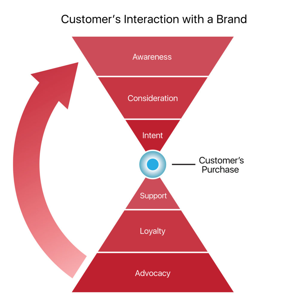
Many companies and brands only focus on the top half of this sales funnel, and once they get a sale, they don’t care anymore. But turning customers who like your product into loyal customers, and further – brand advocates, can result in large groups of people doing a lot of superior marketing work for you, better than any kind of paid advertising. People trust word of mouth and social proof. So how can we use social media to facilitate that?
It just so happens that I love building products that perpetuate this cycle.
II. The Process
I don’t do a lot of fishing myself. But it’s always important for me to form a deep understanding of each business I’m designing for, including, and especially, their target market and customers. During a discovery round, I deep dive into the company’s inner workings in addition to the customer facing user experience, customer profiles, their behavior, the purchase process, customer acquisition, and more often speaking with customers directly to learn about their experiences.
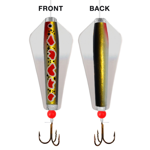
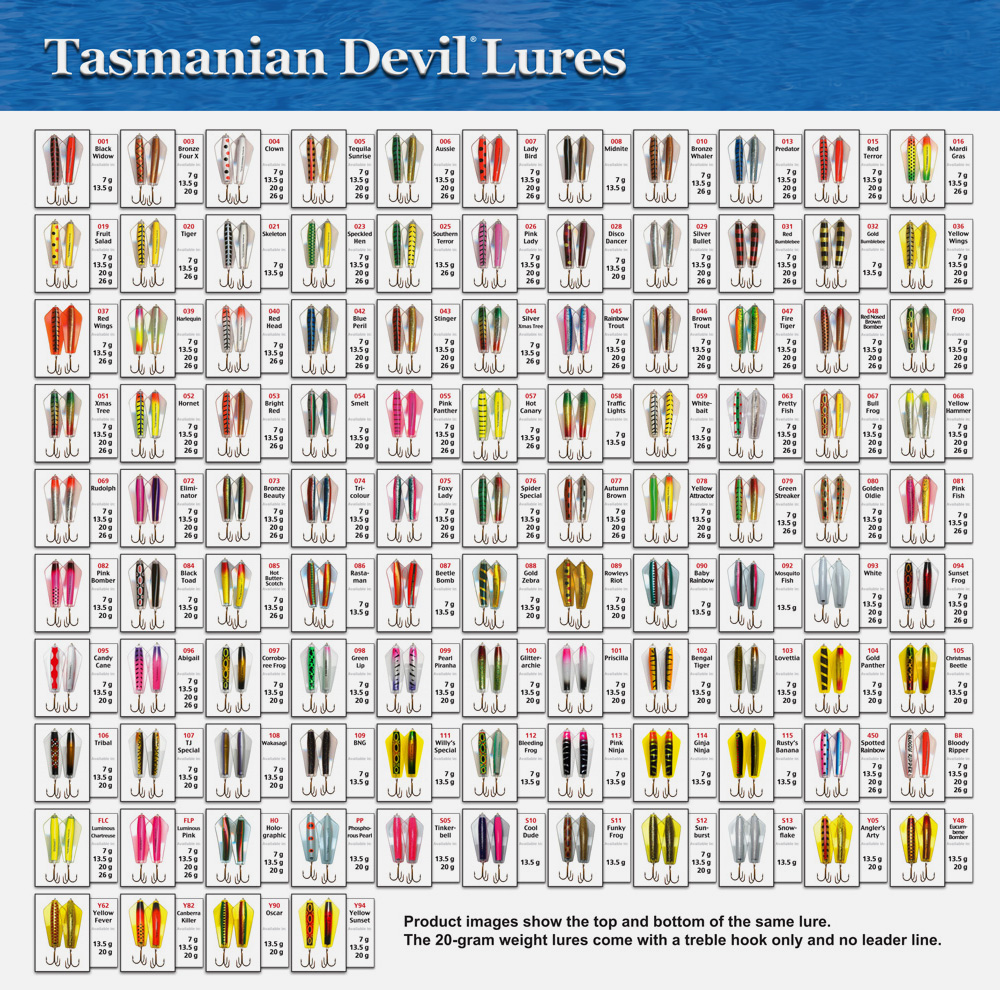
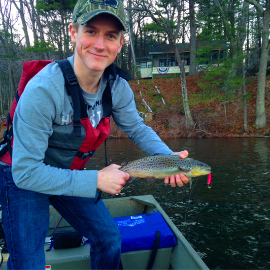
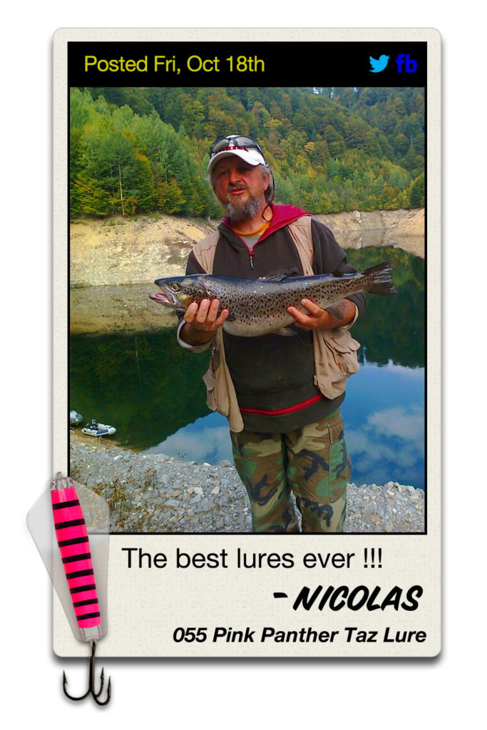
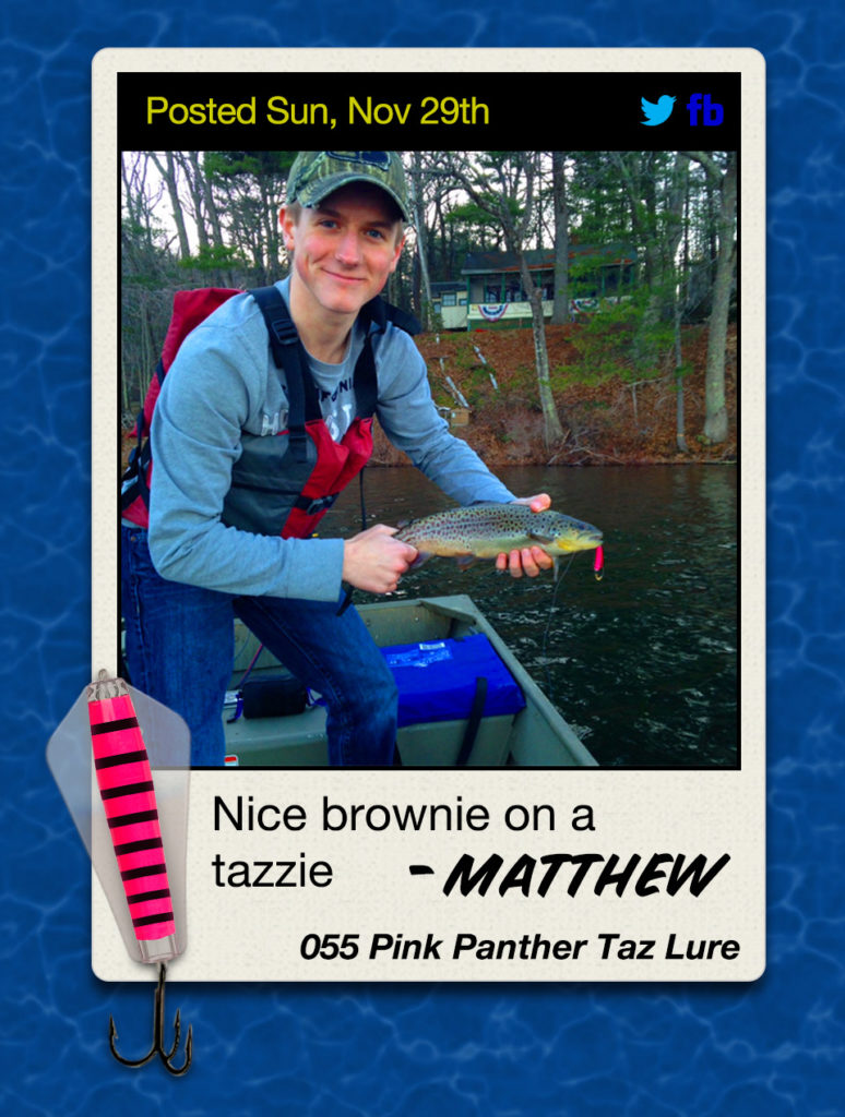
One thing that was evident early on was that buyers loved the product. They’re called Taz Lures, short for Tasmanian Devil, are native to Australia, come in hundreds of different colors and really, really work to catch fish, customers love them.
In addition to creating content posts for social media internally as a baseline, I thought it would be great if we were able to get our customers to create some of that social content for us. It turns out fishing is a perfect vehicle for that.
So Phomeo was created as an answer to the question: “how can we turn our customers into brand advocates?”
This is what I came up with, and I codenamed it Phomeo. It was supposed to be “true love for your social media.” So like Romeo, but with photos, Phomeo. At this point, it was just an internal project name.
The platform was first built as a one-off for this client’s fishing lures.
I recognized instantly that these fishing products not only worked to catch fish, but were uniquely visually appealing which is one of the reasons why customers love them. You see, most customers have their favorite color, or a few different styles they consider lucky, and they repeatedly buy them. Although the fishing lures are made to last, some get lost underwater, wear out, many customers like to buy brand new ones each season. It’s the nature of the business.
One of my favorite designs
This was further proven by analyzing sales trends. Of course there are popular colors and best sellers, but there’s an unusually great distribution in sales numbers among all different SKUs of which there are many – over 100. We also wanted to capitalize on that distribution.
In order to do so, we needed to incentivize customers to upload photos beyond just simply asking them to share. At my suggestion the client opted to turn this promotional tool I was building into an ongoing photo contest almost like an online fishing derby, where he would award 1 winner each month a prize pack consisting of 4 fishing lures of a total retail value of about $30. We would monitor the amount of submissions and up the ante to something bigger if we needed more participation. This promotion would be like a game with real world prizes where customers were free to play every month and win a prize we knew they’d like – they’re already customers.
Sweepstakes vs. Contest
There are some distinctions between contests and sweepstakes which is important to how a promotion like this is run. There are laws that govern some of this type of marketing that you have to be aware of so you don’t accidentally run afoul of some kind of gambling laws. I won’t get too deep into it here, but we conducted a lot of research on these topics and discovered the following: a sweepstakes is based purely on chance, so a winner is picked at random, and you can’t require a purchase as the only way to enter into the drawing. That would be what’s called legally “Consideration” and why sweepstakes such as those on cereal boxes always have a disclaimer of “NO PURCHASE NECESSARY” and an alternative way to enter, usually by sending in a postcard somewhere with your name and address. While we initially wanted to give away a prize to a random person that entered their photo, we wanted to avoid all the complications of a sweepstakes. So we went with a contest instead and some judging criteria, that once per month from the submission pool, the client would choose a winner based on those defined criteria. That gave us a little more leeway, and helped avoid being classified as gambling or a sweepstakes. To be honest, we found most of the fishing lure customers are just happy to be sharing their photo on a platform that gets lots of views. The prize is relatively small, around $30 USD. Either way we’re probably okay, but things would be much different if we were giving away cars every month. For the purposes of this project, we were covered.

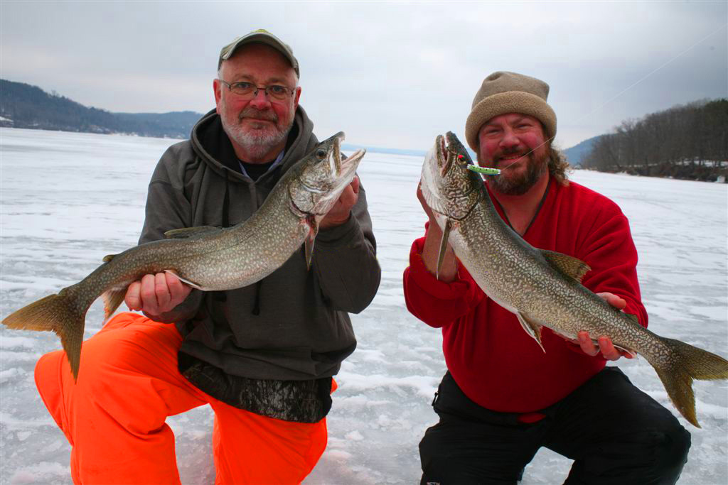
Even though we were running a contest where a winner is decided based on merits, it was important that this contest wasn’t about who caught the biggest fish – never mind that there isn’t an easy or totally reliable way to verify a metric like size and weight of a fish from a remote location – we simply wanted to encourage quality photos from the customer base. That was most important. You can’t control how big the fish you catch is. We just wanted to show that these lures worked and showcase different customer experiences with different lures. The variety would not only confirm its authenticity but also demonstrate the different successful use cases creating powerful social proof.
We wanted to find out which product a given customer had successfully caught a fish with so we could share that information with other customers who would visualize their experience with the product. Then with one click we would link them to the exact same model product for an easy purchase, if they so chose, with the whole process hopefully facilitating increased sales every step of the way.
I love designing complex digital products that for users, are easy to the point of being automated in many respects, but facilitate powerful results.
However, all of this had to be as easy of a process as possible for users.
I’m a huge proponent of ease of use, and making experiences for the user dead simple. On the other hand, we needed to collect some information from users that only they could provide. Not so much to learn about customer behavior, we already had a good understanding of purchase behavior from the client’s main eCommerce platform itself, but information to keep track of submissions and information to point other customers to easily purchase products.
At a bare minimum we needed the customer’s name, an email address to contact them, their fishing photo, an agreement to some terms that cover us legally so we can post their photo on their behalf and use it for marketing purposes, and preferably the product they purchased and used to catch the fish in the photo. It would also be nice if we could get a short comment or caption for the photo from them.
But getting all this information from the customer was a big ask.
If we’re going to ask people to provide information to us that will help us sell more products, it better be easy and worth their while.
I explored ways to “auto detect” the product in the photo and experimented with ways for my client to select the product on behalf of his customer who submitted a photo to him. But in this early planning phase, sample photos provided by the client as an example of what customers might submit and a gauge of what their photos would look like were not detailed enough to detect products via automation. Each of the lures are largely similar besides color. All products are the same shape, have a gloss finish with different color patterns below the clear plastic shell and the differing lighting conditions, cameras, angles – infinite variables really – including a small sized product relative to other subjects in the photo would make machine learning and object recognition unfeasible for this project. After all, these entries would be candid shots, probably taken on a cell phone.
When I design products, I operate under the assumption that my end user is very lazy. It’s just a safe assumption to make things for your lowest common denominator, and when you’re designing a product, that is a person who doesn’t feel like putting the effort in to use the product. I try to make things as easy as possible and incentivize people to use the product. The marketplace is just too crowded with cut throat competition. I want customers to have lots of reasons for using products I build, beyond just accomplishing their goal. I want it to be fun, easy, and memorable in a good way.
I take my work seriously but I think products should be seriously fun to use. That’s not always appropriate for the business case, but at the very least products should be enjoyable or the user should have a sense of accomplishment and satisfaction that a product worked beyond their expectations to help them succeed at their goal.
In my experience, there’s no downside to overcompensating for this.
So building an interface for the client to input their name and email would be relatively trivial, but what about a way for a customer to select the product they used to catch their fish? What if the product wasn’t actually in the picture because the customer only photographed the fish? We could cross reference email addresses to orders, but most customers order multiple styles, so that would not help us narrow down one specific product. We would ask customers to “please include their lure in the picture” anyway, but how could we effectively require it? Gaining great pictures from customers outweighed burdening them with overly complex instructions and restrictions. And even if the lure was in the shot, many of the lures look similar, so what if the client himself couldn’t even recognize the lure based on the customer submitted photo, either because it was too small in the photo or too similar to other styles, or both?
#051 and #058
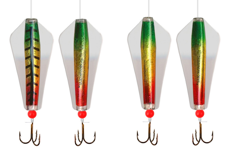
Although Taz Lures come in hundreds of styles, 051 and 058 are not the only 2 that look alike.
It would be best to get the most accurate information directly from the customer and possibly cross reference it from other data sources like their order history.
A simple dynamic search dialog outweighed making a customer log in to pick items from their past orders for many reasons, not the least of which authentication would be an additional, cumbersome step. Many users forget passwords, and we have our own data to prove that beyond just general common knowledge, but also it would not even eliminate the need to select from a list once we present them with the information.
So it just made the most sense to ask the customer what lure they used, hoping they remember, are accurate, and helping them every step of the way by simplifying the process.
But our initial design only asked for the catalog number i.e. 001, 055, Y94, an so on. While these internal catalog numbers were prominently displayed on the product packaging, and many customers did in fact use them, not everyone did.
We had a link positioned under the text field that linked out to a PDF catalog of all the current products where the customer could find their lure cross reference the number and then switch back to the website and enter the number. This was just a beta, but still.
It was rough.
Asking the customer to open a new page and go look up a reference – manually – in a sea of similar looking products to remember a number and then go back to the previous page to manually enter it – not an ideal experience. Not even close. And not an experience I want to be associated with.
So here’s the solution I came up with.
I designed this dynamic search to let customers filter by any attributes associated with the product including:
- Product name
- An internal catalog identification number appended to the name
- Color or combinations of colors
This would be helpful to customers that referred to their favorite lure as “number 120” or maybe they don’t know the catalog number, but do remember the word “Coral” from the name of the lure, Coral Trout.
Or maybe forgot the name and number completely but they know what it looks like so they definitely know the colors in it’s design.
This was much better.
We determined through testing, feedback, and some pretty good hunches that led us to this point, that this was the best implementation of a product selector complete with visual cues for people who we needed to derive information quickly and conveniently, within the given project constraints.
This product selector is part of the following clear and easy to use form, labeled with numbered steps, that tries not to overwhelm users, only asks them mission critical information, and reassures them every step of the way, including protecting their private information. We even took this further by stripping the EXIF data from photos, to protect users. More on that later.
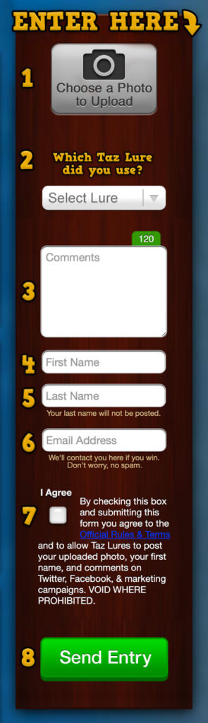
Although 8 steps is really more than I like to present in a product like this, by being upfront with the customer about how many steps their are and allowing all of them to be visualized at once on one page, they can determine pretty quickly that this shouldn’t take too long.
I chose not to have a secondary email confirmation field in the form because I find them to be useless. It’s a burdensome step that most people have found a quick way to deal with: just copy and paste from the first field. I myself have always just copy and pasted my email in twice on every form that requires it, and I made the decision that since this isn’t a medical form for example, and with there being a prize on the line, and since it is the only contact information we ask for, the user is more than likely going to want to make sure it’s correct anyway.
Even the photo uploader was custom designed to avoid issues and make the submission process easy for the user.
My developers and I experimented with ways to give people the option to crop photos or simply rotate them, but we decided that offering users this functionality almost encouraged users to take these steps as if we were asking for them to improve their photo by cropping or scaling it, despite the feature often being totally unnecessary. Something we were going to provide for convenience ended up further complicating an experience that was meant to be streamlined.
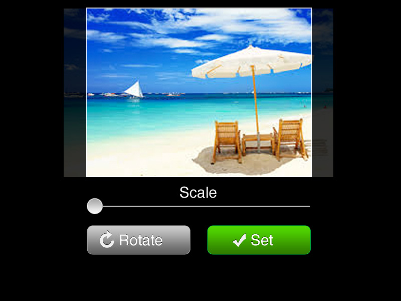
Offering crop options was adding extra steps beyond the 8 already there. So I decided that if users wanted to edit their photo, they were free to do that on their own device, most of which included better features than what we could offer in a browser anyway. We didn’t want to turn our product into a photo editing platform with extra tools and features. This product was meant to be a photo contest platform – we weren’t going to let feature creep get in the way of that. Especially when it unnecessarily complicates the experience.
Instead I provided the user with a quick visual representation of what their image would look like directly in the browser upon upload so they could make sure they uploaded the correct photo. This was a custom designed uploader that used a few tricks to work quickly, easily, and securely.
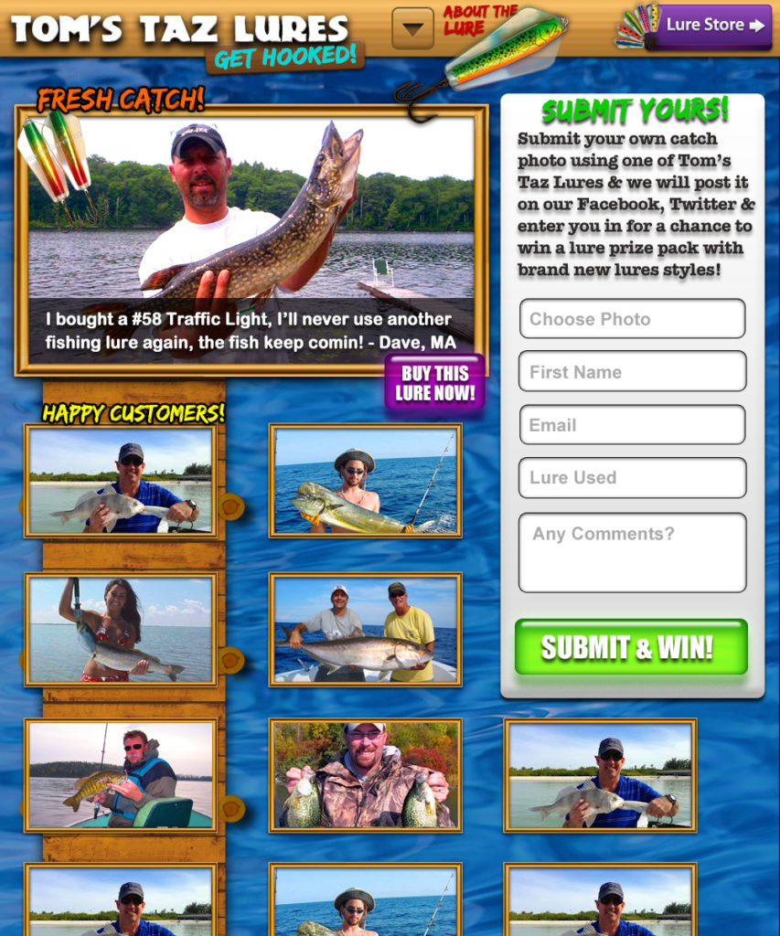
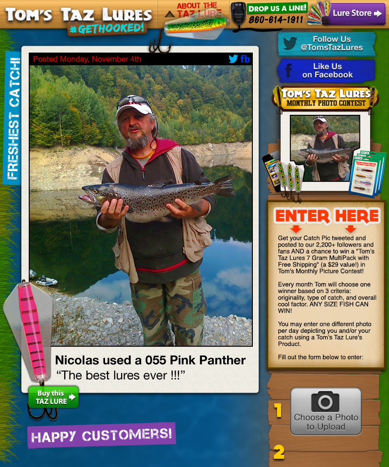
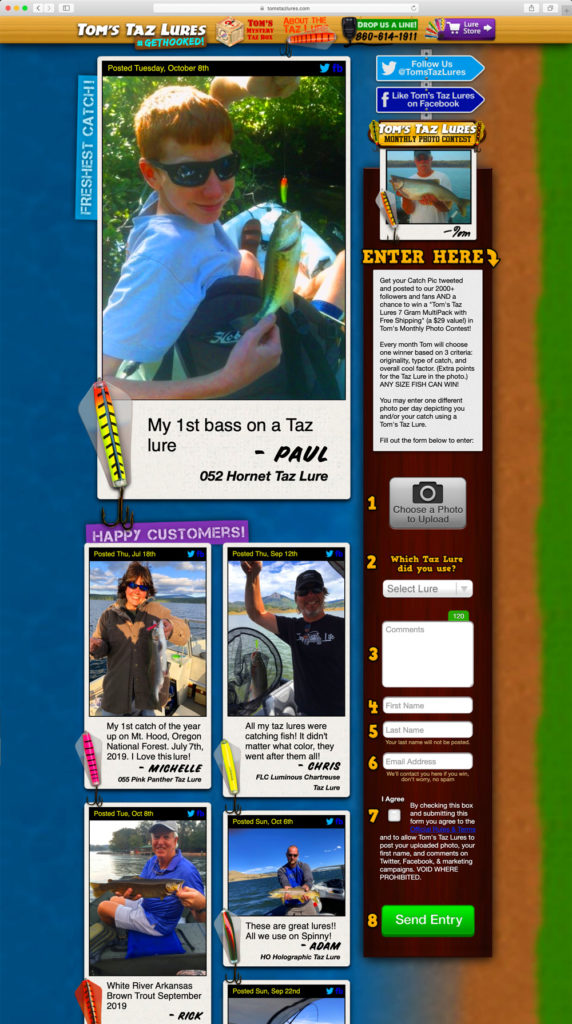
This form was part of the new home page for the client’s store which would not only allow for new submissions directly on the page in this convenient form, but also showcase all the customer entries in a feed structure, with the newest entry featured prominently at the top.
Even though the client and I agreed on the visual appeal of presenting hundreds of exciting, real customer photos right on the homepage, I was concerned about photos automatically appearing on the public site after user submission.
If they did, this would present an opportunity for bad actors to send inappropriate photos or people to spam entries that would be published immediately. Even competitors could potentially flood the public site with objectionable content. While this wasn’t something we were sure would happen or were overly concerned about, I wanted to plan for it regardless because a problem like this could be devastating to the clients brand. Not to mention many of the users of these fishing products are kids. I just didn’t want anything getting posted that shouldn’t be there. This is a family friendly product and letting any visitor anywhere in the world automatically posting images is a recipe for potential problems.
So after the user submits the photo, I decided it would be best to have the client review it before it is posted anywhere. I designed an admin panel with an approval queue to facilitate this. This feature was not intended to judge a submission based on quality, but more so to filter out spam and potentially objectionable content.
The panel allows the client to be able to approve entries manually in a very easy manner. Once an entry is approved or rejected, the page asynchronously displays the next submission up for approval in the queue.
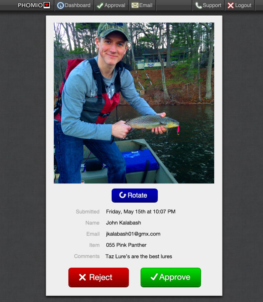
For this case, the client decided he wanted to log in and manually approve entries at a certain time every day which worked with within the confines of his schedule. So once per day the system emails the client to let him know how many entries have accrued in the queue. That way he’s not bothered by swarms of entries coming in at other points of the day.
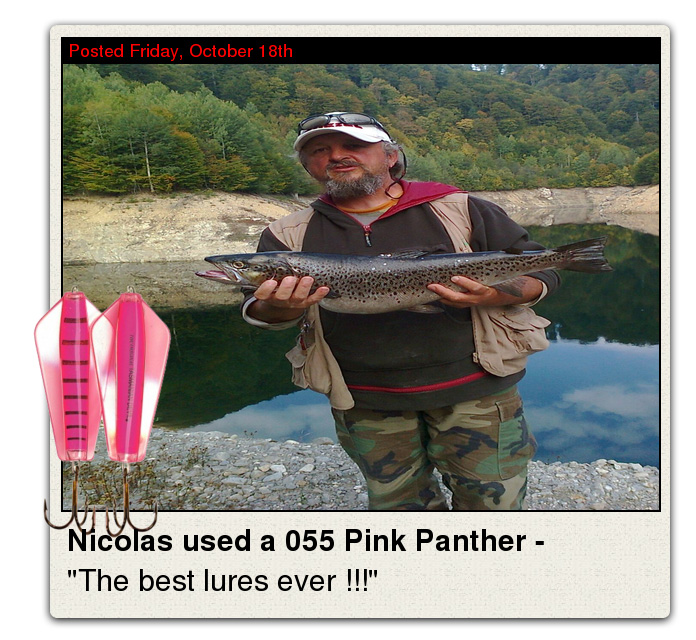
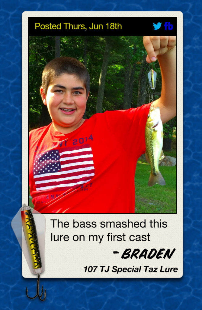
But something special happens when the approve button is clicked. You see, it wasn’t enough for me to just have the system post the raw image to social media. It was important that the visual appeal of these photos really matched the client’s brand and the products themselves. One of the reasons people buy these lures in the first place is because they look cool with a striking visual appeal. So it was equally important to me that the way these customer submissions were presented was itself cool too. I wanted it to look professional and higher effort than just plopping a photo directly on social media.
So I designed a photo frame in the style of a polaroid. Something the client really liked.
As a side note, some of the art direction for this project was dictated by the client. He had a lot of input. Sometimes it’s difficult when working with clients when as a professional designer you disagree with decisions they make. But ultimately it’s their company, their business, their brand. No matter how big or small a company is, as a designer, I respect that, the vision is theirs and I’m there to advise the best I can. I will do my best to justify my design decisions and articulate why I may disagree with something, but ultimately the client has the final say.
I wanted to create a photo frame that gave the impression of a polaroid maybe taken by the river side. Something you might hang on a cork bulletin board in your fishing cabin with a note from the person who took it, a commemoration of the event of catching the fish, with their name of course (first only, as we respect the customer’s privacy) and the lure they used for their awesome catch!

we just want their great photos and a way to reach them if they win
But the first way we accomplished this polaroid was less than ideal.
During testing, and an early iteration of the project, we simply fit photos into prefabricated frames and overlaid the customer’s photo, comments and selected product compiling them into one PNG image using GD Graphics Library to display on the site.
But we ran into a number of problems. First, not all photos are the same proportions, some are portrait and landscape, some are just square, and some have odd dimensions because the user cropped the photo themselves with different proportions.
Then, the PNG images were huge. We used the PNG format because we needed the transparency to make round edges and overlay on some intricate backgrounds, but the file size difference was 2MB for the PNG, with the same JPG image weighing in at ~200KB. The site was loading like it was on dialup because there were so many large images, even with mostly only a handful of test images at this point. Still it was dragging.
Also, because everything was a flattened image, no specific section could be linked to another page independently. We didn’t want to use outdated image maps to create links, although the idea came up, but it was important to be able to link different parts of the photo to different places; the product image to the product page, the photo to social media, etc.
But worst of all, because of the prefabbed frames and the way this beta system was designed, it was squishing the image to fit into a 4:3 ratio image size regardless of the dimensions of the preprocessed customer image. It’s not that we didn’t anticipate this problem, we just were experimenting with an early prototype. But I can’t think of a single bad design habit that is worse to me than distorted photos. You can get away with a few percentage points of distortion in certain very specific use cases, but once an image hits a certain point – and there’s not much margin here – it gets ugly and just plain wrong. Circles can’t be ovular. And subjects like people can’t be stretched. It’s so obvious, so jarring, and so unprofessional. And I can’t believe there are even designers out there who still ship things like this. YOU CANNOT EVER DISTORT A PHOTO LIKE THIS! EVER!!!!!111 /End rant.
So obviously this was unacceptable and this method wasn’t going to work.
But I was experimenting with it because it was replicable. I was trying to build “puzzle pieces” that could be assembled together the same way for every photo that came through. So although we learned a lot quickly during this prototype phase, the truth was we needed another approach.
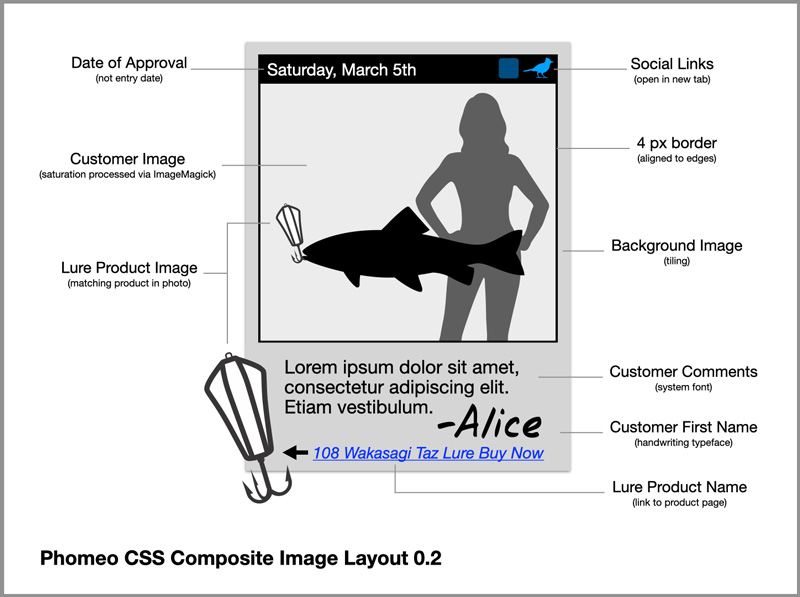
Some responsive front end code was the way to go.
Laying these elements out in HTML/CSS was more complex in some ways but certainly gave us more control and a better end result.
Font choices played a role here. I didn’t want to be overly utilitarian, but at this stage of the project, and within the resources we were working with, it didn’t need to be overly complicated either. But I did want it to look more like the person who entered the photo signed it, rather than the terse phrase we were using “<First Name> used a <Lure Name> -” which felt robotic and cold. So I changed up the design which lead my dev team to approach the image generation differently.
I settled on Speedy Marker for the customers first name to provide a handwritten feel. I even experimented with randomizing the typeface for the “signature” to give everyone’s name a different handwritten look since people in the real world all have different handwriting. But there weren’t enough good looking, legible, handwritten style typefaces that looked like they fit with our art direction and style. It just looked messy. I even considered developing an input field for people to draw their first name with their actual handwriting, but that obviously added to the complexity of the submission and would have certainly become a literal barrier to entry. So I kept it simple with Speedy Marker, a great font that is clear to read and still looks like someone could have quickly wrote it down with a Sharpie.
Likewise, the Helvetica system font I was already using was sufficient for the customer’s comments for this iteration of the platform. Widely available and sufficiently legible – which was important – it worked just fine. We discovered through just own internal tests that using any handwriting typeface for the body text of the customer’s caption – even just one consistent one, while on brand, fun, and still remained faithful to the theme and art direction we were aiming to achieve, it just made the text itself unnecessarily hard to read and really detracted from the overall presentation more than anything.
It was also important to limit the length of the captions. For the comment field in the customer entry submission form I wanted to show users that we only wanted a short message.
We chose to limit the comments length because I didn’t want to have comments that were several sentences long, overshadowing the photo which was meant to be the centerpiece and focal point of the marketing effort. In short, it just looked bad to have a small photo relative to a wall of text.
I decided to limit it to a little less than the character count Twitter uses for tweets which at the time was 140. That length was about the maximum we were looking for, so I chose 120 characters, just in case we ever wanted to tweet someone’s comments and have enough character spaces available to append a link to media (the photo) as well. But rather than just tell the customer about the 120 character limit in a relatively lengthy instructional label, why not just show them through great design? So I designed this custom character count indicator:
In addition to counting down to zero from the 120, the count indicator also changes color to give a general visual indication of when users should begin to “wrap up” their comments. The first design faded gradually between green to yellow and finally red but through testing it was clear the gentle color transition wasn’t enough to alert users at all. The more abrupt color change from green to yellow and finally to red is clear visual indicator that draws the eye and helps users understand when it’s time to start wrapping things up. We’ve never had a submission that got cut off. Every user so far has gotten the message and kept their caption brief.
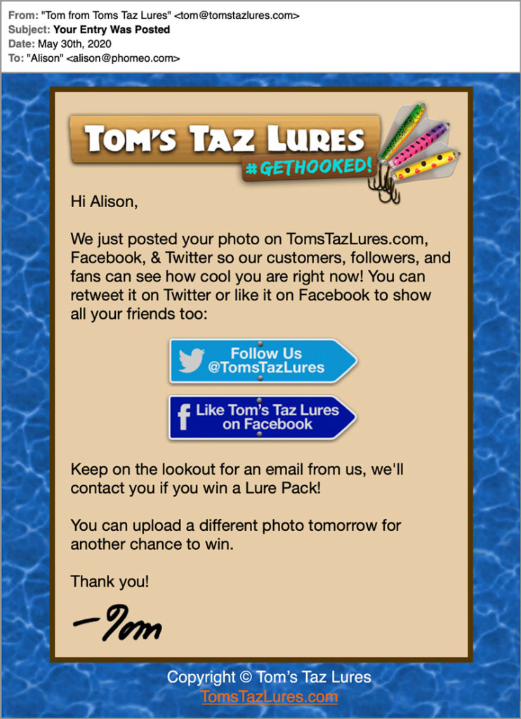
Upon client approval we generate the polaroid image automatically, then post it to Facebook and Twitter via their API. Instagram limits automatic posting capabilities via their API.
This was my first project working with automated image generation, and an amazing learning experience.
Interestingly, I stumbled upon a little detail regarding data embedded into photos, that lead us to make some significant changes to accommodate for privacy considerations. A unique bug popped up that left us scratching our heads for a bit. On desktop, our final polaroid photo frames looked great. We used phantomJS to generate the flattened image for social media but the same combination of the image and the HTML and CSS that we used for that is what generates the visuals on the homepage. And everything consistently looked great on Firefox desktop. But when we were testing on mobile, some photo images were getting rotated within their photo frame. Unbelievably, the issue was completely inconsistent here. All photos were normal on desktop, but on mobile, some were rotated 90 degrees, some were completely upside down in their frame!
It would have been funny if we weren’t under the gun to get it fixed. The presentation was unacceptable. We couldn’t possibly display images publicly like this to customers, it would not only undermine credibility of the contest itself, but also the entire brand. Customers would think something very wrong if they came across photos upside down and sideways in random patterns all over the contest home page. Clearly something was going on here.
We realized immediately the issue had to be related to something about the images themselves, it wasn’t our code.
Finally, after a few hours of trouble shooting and examining the image files themselves we discovered the culprit:
EXIF data.
Mobile phones use accelerometers and orientation sensors for all different kinds of applications. As it turns out many phone models store an orientation value in the EXIF data that is appended on to the photo file along with other information like the camera model, exposure time, a geolocation of where the photo was taken, and even other data like lens focal length. And when the image file is displayed, some browsers actually respect that orientation tag in the EXIF data, while other browsers don’t. At the time, we were seeing issues with photos only in Safari on desktop (which respected the EXIF orientation tag) and mobile browsers. Other browsers on desktop were unaffected. Once we accounted for this in our code, the problems were solved. It was accounted for by using ImageMagick to rotate the image to its intended orientation according to the EXIF data, then zeroing out the orientation data. If for some reason the rotation was incorrect after that, the client was provided with a simple rotate button during the approval process to easily change the rotation of the image before approval. I chose to use only one button to avoid confusion. The button only rotates counterclockwise, but 3 quick clicks of the button yields the same results as 1 click on another button that would rotate the opposite direction. Instead of giving the client extra buttons which would result in further decision making processes, although maybe minor, having one simple button that achieved the same results, outweighed overcomplicating the process.
I always do my best to eliminate unnecessary UI and reduce complexity of the experience for unparalleled simplicity.
I also didn’t want EXIF data stored to protect the customer.
Many people simply say “Yes” or agree to popups on their phones to quickly bypass them, without really understanding the consequences of doing so. I’ve seen this happen first hand with camera apps on phones, where people unknowingly geotag their photos because they just agreed to the popup the first time they opened the app. As expected, we ended up getting a lot of geolocation data of where the photos were taken and the way we initially had the system set up before launching our production instance, that data was still present on the final photo file that appeared on the public facing site.
We could have used that data for many purposes, but for this use case, we just wanted to destroy it so no one had access to it on the public site. We anonymized the data and saved it in a separate table so it had no connection to the final files.
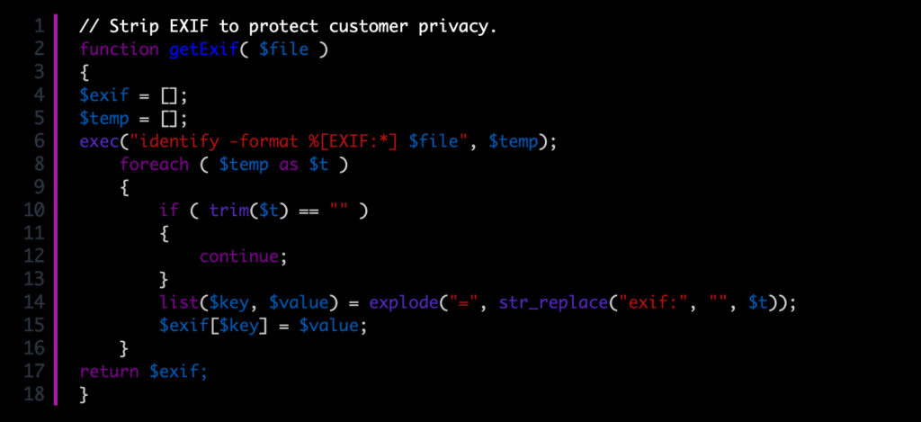
The final images were processed with ImageMagick to remove all the EXIF data, then we generate 2 other smaller standard sizes of the photo to optimize them for serving up on the page. The original user images can be quite large and I didn’t want a repeat of the slow load times with huge data files like we encountered in the prototype.
So the final images are achieved using a combination of ImageMagick and PhantomJS, where we perform some actions on the photo to sweeten the colors with some saturation, and strip EXIF data that mobile phones often have a habit of embedding into the photo file. ImageMagick handles these procedures. Then we create a “screenshot” on an internal HTML layout page via PhantomJS which is a scriptable headless browser that’s great for finalizing a complex layouts generated via a webpage into a final composite image. Certainly there are other ways to achieve this, but PhantomJS fit in our tech stack. Here’s an example of a final image that gets posted to social media:
After each customer’s image is approved, we email the customer with some exciting copy in a branded email and ask them to share their post on social media with their friends. Included are some convenient links to the social channels where their photo was posted.
The main site is conglomeration of live entries from customers really all over world. Ever changing with new posts everyday, it’s truly a living work of art that clearly demonstrates to visitors the value of the product. Not just with high quality photos which all the entries are, but the sheer quantity of them too.
What about awareness? We needed to drive engagement but more specifically participation in the photo contest. Visitors are certainly invited to participate right on the homepage, so if their coming to the site to make a purchase, they’ll likely be well aware of the photo contest. But I wanted to remind them while they have the product in hand.
Print isn’t dead yet. While I can’t think of a multitude of uses for print today, I’ve used print media on many projects in exactly this way to great effect:
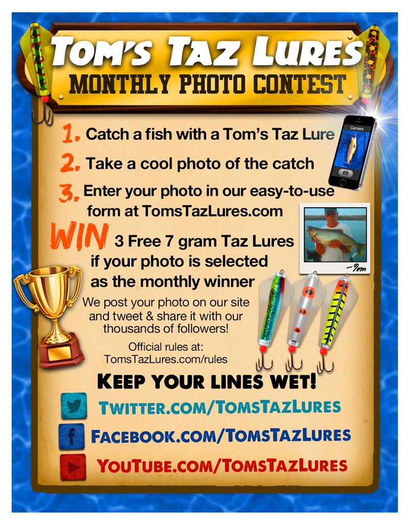
Although looking at this now there are many changes and improvements I would make, it was still highly effective in achieving our goals. Sent in every outgoing package to all customers from all sales channels including the internal eCommerce site and channels like eBay, this product insert, with a design heavily influenced by the client, drove real participation in the photo contest. Everyone who ordered a lure was invited to participate and have their awesome photo posted to not only the website, but also on the company’s social media channels where there was a decent following that was continuously growing.
Besides social media, which at the start of this project had many followers but relatively little engagement, we also sent out email marketing to let customers know about the contest. We also really needed people who had Taz Lures specifically. While the client and I probably would not have complained if people had sent in photos of large fish they had caught using other types of lures, it’s really not what we were after. The whole goal was to leverage the existing and growing customer base, who owned the actual product, to show success of its use and share that with others to bring in new customers. It turns out reminding every customer about the photo contest with a glossy, attractive, colorful, eye catching postcard sized communication directly in their order right beside their Taz Lures did the trick to start that cycle. We’ve consistently seen engagement just from those inserts alone, and while I can’t share exact numbers, we received hundreds of submissions in a very short amount of time.
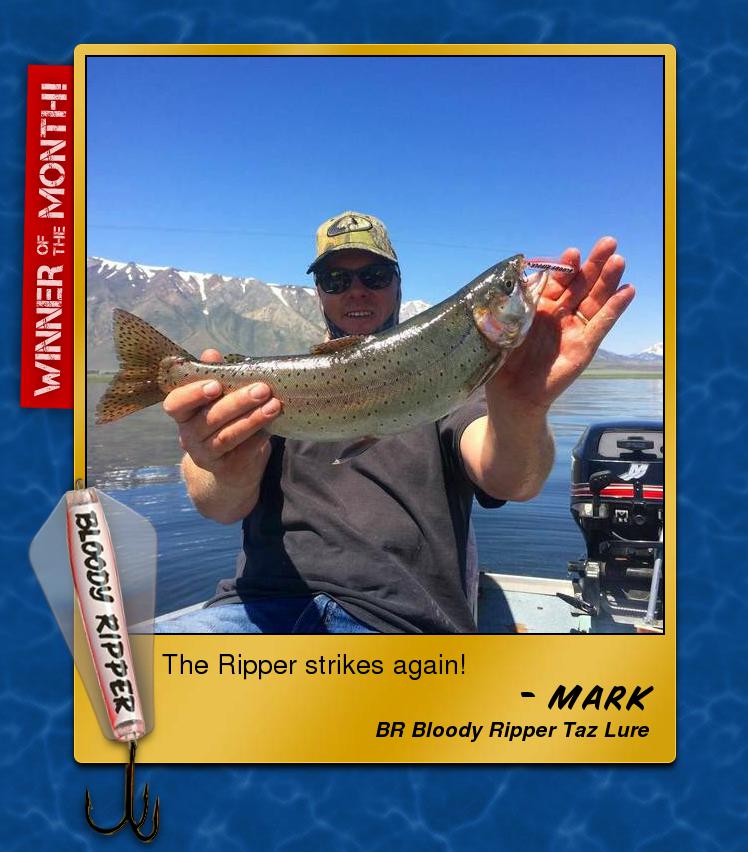
Winners are reposted with a congratulatory message and a gilded frame marking them as a winner that remains prominently at the top of the page for a week, before the photo rotates down the page retaining its recolored frame to denote the win. We email the winner asking them to reply to the email with the mailing address of where they want their prize sent, and client handles the prize delivery from there. The engagement and social proof is well worth the $30 per month prize. You literally can’t buy better advertising.
III. The Results
It was obvious as soon as we launched this promotion that it would be successful.
Striking the balance between cost-benefit, not only for building the project, but also as a consideration of the efforts of our users, was so important to this projects success.
The only thing I underestimated was the willingness of fishermen to share their photos of their catches. I knew incentivizing them would encourage many photos, but people loved this promotion and still do. Everyone was really into it and that was true not only anecdotally from the submission comments, and clear from the quality of the photos but also the data.
People who fish love to show off what they catch! And it makes sense. But the data backs it up too.
Besides the size of the fish, could you ask for a better photo? Endearing photos like this are just as welcome as huge sized fish which is why we didn’t emphasize the need for huge catches to submit a photo. Why would we want to discourage a photo this good just because the fish is a little on the smaller side?
But how can we measure the success of all this?
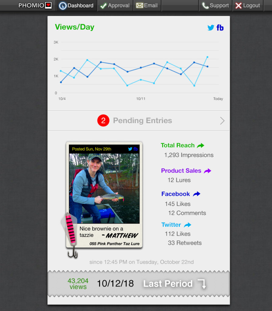
Included in the client’s admin panel is a custom-designed dashboard with clear and easy to read and understand statistics.
We got hundreds and hundreds of submissions.
And tens of thousands of social media shares later, it looks like we landed a big one.
IV. Phomio – Above and Beyond
With all these design considerations in place, Phomeo had been a great success for this client. Even though great social proof is really important to every B2C I can think of, photo contests and galleries don’t lend themselves necessarily well to every consumer product or service. But there were other things in mind that I felt this platform could be scaled to serve. So I decided to build it out in a more robust platform with some extensibility that could accommodate other business cases.
With the advent of .io domain names and their rise in popularity among tech companies and products, and in my constant quest for easier user experience, down to even helping the user by allowing them to type fewer letters, I decided to change the Phomeo internal name to Phomio in order to capitalize on the Phom.io domain name. Same pronunciation but a bit easier to navigate to.
This superior branding outweighed the connection to the Romeo name which many people I discussed it with didn’t even recognize anyway. There just wasn’t enough of a connection there. Phomeo started solely as internal project name but ultimately fell to a superior rival. Shakespearean.
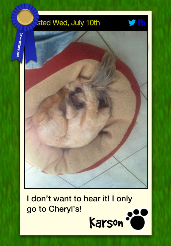
But I iterated on the initial system to make improvements, including building out a more robust platform to be able to serve other clients and their unique use cases. I deployed a Phomio photo contest for a pet grooming client with another round of great results. Instead of a selling products, the goal was to drive interactions on social media and create brand awareness through some viral photos.
I designed the next version of the system to be able to handle different embellishments to photo frames depending on the product or service and client needs. So instead of a fishing lure, we could accommodate other images according to the theme.
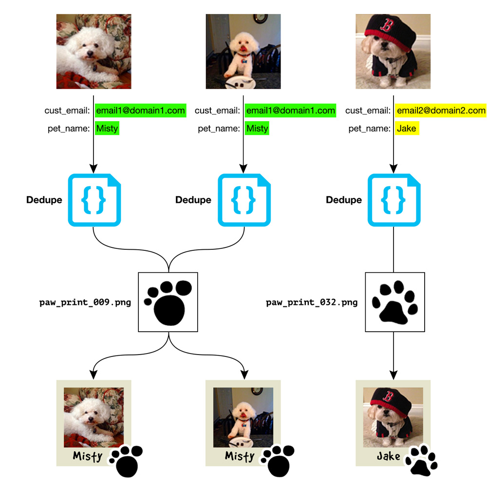
We had lots of fun with this one. Since we weren’t showing a product like a fishing lure overlaid on the “polaroid”, I still wanted to personalize the photos. For this contest I wanted to have the text displayed on the photo to be a “quote” from the Pet, as if they were the ones who said the caption. And instead of the photo being signed by a the customer, it would be signed by the pet, with their name displayed. But just to up the creativity how would a pet sign a photo? With their paw print of course. So that’s how I chose to use that extra real estate on the photo. And all pet’s have different shaped paws.
So when a submission is entered, we generate a random paw print and append that image to the pet photo.
But what if the same customer submitted twice? Not only would that be ideal, but we encouraged it. We could have let the paw print still be randomly generated and maybe no one would have noticed that the same dog had different paw prints. But if the same pet was posting a new photo, their “signature” really should be the same right? Most people have the same signatures. Dogs would have the same paw prints. So I created a system to match them up by cross checking the customers email address with the pet name. It was important to use both variables because some customers had more than 1 dog and used the same email address but submitted photos for completely different pets. I didn’t want to 2 different dogs to have the same prints either.
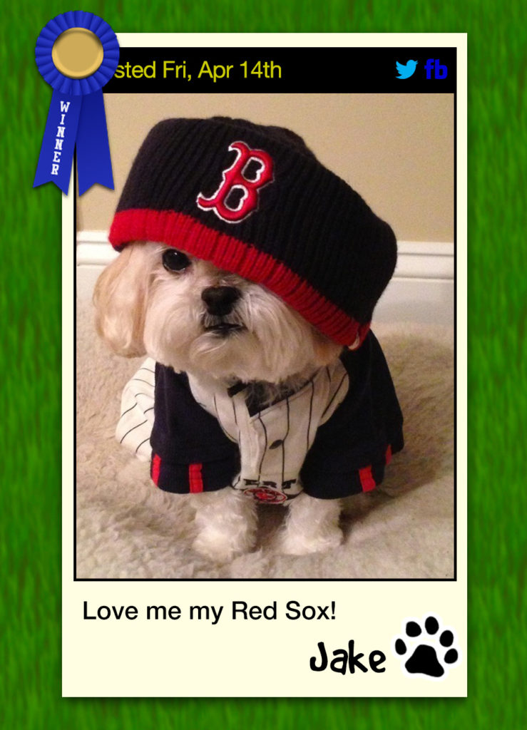
Here’s a few examples of Phomio being used for a photo contest for the Pet Grooming Shop:.
These cute and funny pet photos received a lot of interactions. Far beyond the expectations I pitched to the client.
Not only do I conceptualized, design, and execute entire platforms that drive growth, but I think of and plan for every detail that makes a system like this run to help a business succeed including keeping the branding and ultimate business goals in mind with a great experience down to the pixel.
A picture really is worth a thousand words.
And worth a lot of brand awareness, advocacy, and engagement too.
Hopefully you agree that even just the visual results speak for themselves.